You make us look really good.
It's our one-year brandiversary, and we're looking back with pride on the paper, pixels, and playfulness that have shaped the past year. In this, Part 1, we take a look at the meaning behind our refreshed identity. In Part 2, read about how you responded and made it your own.
A future filled with opportunity
In January 2017, we turned the page on our Library brand, unveiling a colourful new approach. The new Halifax Public Libraries identity was designed by local agency, Breakhouse.
The brand speaks to the Library's strengths as a launch point for growth in our community and commitment to pushing boundaries and adapting to community needs.
Symbolism
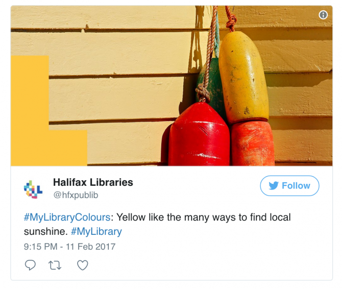
The monolithic L stands as as a cornerstone for the intellect and information that will always remain at the heart of the Library, yet also as an upward and forward moving beacon representing the Library's bold, ongoing departure from the expected. The L is held up and supported by community.
The Library logo combines 14 monolithic Ls, representing each of our branches, woven together as a family.
Our brand was inspired by paper and pixels: The concept embraces tradition and technology; handcrafted and digital, past and future woven together – the experience of reading a book versus surfing the web.
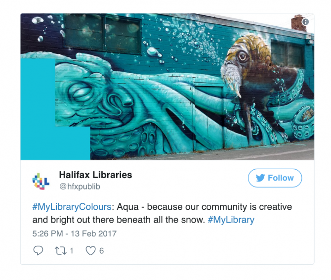
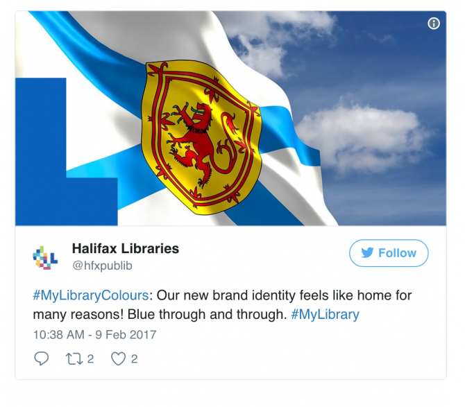
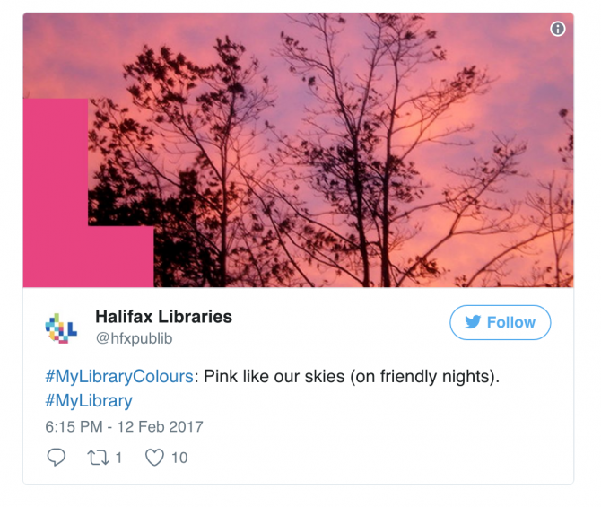
Like an octopus, the logo adapts to its surroundings becoming as quiet or as vivid as needed, infinitely adaptable in colour and in form. Its official colours were drawn from our local landscape and culture.

 Part 2: How You Brought Our Brand to Life
To learn more about the inspiration and symbolism behind our brand, read the story from Breakhouse.


Add a comment to: How You Brought Our Brand to Life: Part 1